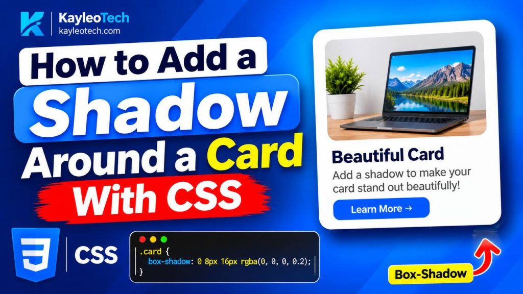
A card is one of the most common elements used in modern website design. You can find cards on blogs, technology websites, online stores, learning platforms, and almost every website that displays information in a clean and organized way.
However, a card without a shadow can sometimes look flat, especially when it is placed on a plain background. Adding a shadow around a card with CSS helps create depth, improve visual separation, and make the design look more professional.
The good news is that you do not need JavaScript or any external library to create a card shadow. CSS provides a simple property called box-shadow that allows you to add shadows to almost any HTML element.
In this guide, you will learn how to add a shadow around a card using CSS, understand how the box-shadow property works, create different shadow styles, and apply practical examples to your own website.
What Is a Card Shadow in CSS?
A card shadow is a visual effect that makes an HTML element appear as if it is slightly raised above the background.
For example, imagine a blog article card with a white background. If the surrounding page is also white, the card may be difficult to distinguish from the background.
Adding a subtle shadow helps separate the card from the page.
CSS uses the box-shadow property to create this effect.
Here is a simple example:
.card {
  box-shadow: 0 4px 10px rgba(0, 0, 0, 0.15);
}
This CSS adds a soft shadow around an element with the class name card.
The shadow appears below the card and spreads slightly around its edges.
How to Add a Shadow Around a Card With CSS
The easiest way to add a shadow around a card is to use the CSS box-shadow property.
Let’s start with a simple HTML card.
Step 1: Create the HTML Card
First, create a basic HTML structure.
<!DOCTYPE html>
<html lang="en">
<head>
  <title>CSS Card Shadow</title>
</head>
<body>

  <div class="card">
    <h2>Welcome to Kayleotech</h2>
    <p>Learn HTML, CSS, and modern web development.</p>
  </div>

</body>
</html>
The div element creates the card container.
Inside the card, the h2 element displays a heading, while the p element displays a short description.
At this point, the card contains only HTML. It does not have a background, padding, or shadow.
Step 2: Add CSS Styling
Now, add CSS to make the card look like a proper card.
.card {
  width: 300px;
  padding: 20px;
  background-color: white;
  border-radius: 10px;
  box-shadow: 0 4px 10px rgba(0, 0, 0, 0.15);
}
This is the most important part of the example.
The box-shadow property adds a shadow around the card.
The other properties help improve its appearance:
widthsets the card’s width.paddingcreates space between the content and the card edges.background-colorgives the card a white background.border-radiusmakes the corners rounded.box-shadowadds the shadow effect.
Step 3: Add a Background to the Page
A shadow becomes easier to see when the card is placed on a slightly different background.
body {
  background-color: #f2f4f7;
  font-family: Arial, sans-serif;
  padding: 40px;
}
The light gray background creates a subtle contrast with the white card.
This makes the shadow more visible without using a dark or heavy effect.
Complete Example
Here is the complete HTML and CSS code:
<!DOCTYPE html>
<html lang="en">
<head>
  <meta charset="UTF-8">
  <meta name="viewport" content="width=device-width, initial-scale=1.0">

  <title>CSS Card Shadow Example</title>

  <style>
    body {
      background-color: #f2f4f7;
      font-family: Arial, sans-serif;
      padding: 40px;
    }

    .card {
      width: 300px;
      padding: 20px;
      background-color: white;
      border-radius: 10px;
      box-shadow: 0 4px 10px rgba(0, 0, 0, 0.15);
    }
  </style>
</head>
<body>

  <div class="card">
    <h2>Welcome to Kayleotech</h2>
    <p>Learn HTML, CSS, and modern web development.</p>
  </div>

</body>
</html>
Understanding the CSS box-shadow Property
To create better card designs, it is important to understand how the box-shadow property works.
The basic syntax is:
box-shadow: horizontal vertical blur spread color;Each value controls a different part of the shadow.
1. Horizontal Offset
The horizontal offset controls how far the shadow moves to the left or right.
box-shadow: 5px 0 10px gray;A positive horizontal value moves the shadow to the right.
A negative value moves it to the left.
For example:
box-shadow: -5px 0 10px gray;This creates a shadow that moves toward the left side of the card.
2. Vertical Offset
The vertical offset controls how far the shadow moves up or down.
box-shadow: 0 5px 10px gray;A positive value moves the shadow downward.
A negative value moves it upward.
For most card designs, a positive vertical offset is commonly used because it makes the card appear slightly raised from the page.
3. Blur Radius
The blur radius controls how soft or sharp the shadow appears.
box-shadow: 0 5px 15px gray;A larger blur radius creates a softer shadow.
A smaller blur radius creates a sharper shadow.
For example:
box-shadow: 0 4px 5px gray;This creates a relatively sharp shadow.
box-shadow: 0 4px 25px gray;This creates a much softer shadow.
4. Spread Radius
The spread radius controls how much the shadow expands or shrinks.
box-shadow: 0 5px 10px 5px gray;The fourth value, 5px, expands the shadow outward.
A negative spread value shrinks the shadow.
For example:
box-shadow: 0 5px 10px -3px gray;This creates a tighter shadow around the card.
5. Shadow Color
The final value controls the color of the shadow.
You can use named colors, hexadecimal colors, or RGBA colors.
box-shadow: 0 5px 10px black;However, using a fully opaque black shadow can make the design look too heavy.
A better option is to use rgba().
box-shadow: 0 5px 10px rgba(0, 0, 0, 0.15);The final value, 0.15, controls the opacity.
This makes the shadow transparent and softer.
Different CSS Card Shadow Examples
There is no single shadow style that works for every website.
A blog card may need a subtle shadow, while a featured product card may need a stronger effect.
Here are several useful shadow styles.
Example 1: Simple Card Shadow
This is a good starting point for most website cards.
.card {
  box-shadow: 0 4px 8px rgba(0, 0, 0, 0.12);
}
The shadow is subtle and does not distract from the content.
You can use this style for blog cards, article previews, and basic information boxes.
Example 2: Soft Card Shadow
A soft shadow is useful when you want a clean and modern design.
.card {
  box-shadow: 0 8px 20px rgba(0, 0, 0, 0.08);
}
The larger blur radius makes the shadow spread smoothly around the card.
This style works well for educational websites, dashboards, and landing pages.
Example 3: Strong Card Shadow
Sometimes a card needs to stand out more clearly.
.card {
  box-shadow: 0 10px 25px rgba(0, 0, 0, 0.2);
}
This creates a stronger shadow.
It can be useful for featured content, important notices, or cards that appear above other elements.
However, avoid using strong shadows on every card because the design may become visually crowded.
Example 4: Shadow Around All Sides
If you want the shadow to spread evenly around the card, use zero offsets and a positive blur radius.
.card {
  box-shadow: 0 0 15px rgba(0, 0, 0, 0.15);
}
Because both offsets are zero, the shadow is not pushed in a particular direction.
Instead, it spreads around the card.
This is useful for modal boxes, floating panels, and simple content cards.
How to Add a Shadow to a Card on Hover
A hover shadow appears when a user moves their mouse over a card.
This effect is common on technology websites, online stores, and blog pages.
It helps show that the card is interactive.
You can create this effect using the CSS :hover pseudo-class.
.card {
  background-color: white;
  padding: 20px;
  border-radius: 10px;

  box-shadow: 0 4px 10px rgba(0, 0, 0, 0.1);

  transition: box-shadow 0.3s ease,
              transform 0.3s ease;
}

.card:hover {
  box-shadow: 0 10px 25px rgba(0, 0, 0, 0.18);

  transform: translateY(-5px);
}
Let’s understand what happens here.
The .card selector defines the normal shadow.
The .card:hover selector changes the shadow when the user moves the mouse over the card.
The transition property makes the change smooth instead of immediate.
The transform: translateY(-5px) moves the card upward by five pixels.
Together, these properties create a smooth card-hover effect.
A Note About Mobile Devices
Mobile users do not have a traditional mouse pointer.
Therefore, do not make important information or functionality available only through a hover effect.
The card should remain understandable and usable on touchscreens even when the hover effect is not triggered.
How to Add a Colored Shadow Around a Card
CSS also allows you to create shadows using different colors.
For example, a red shadow can match the branding of a website that uses red as its primary color.
.card {
  box-shadow: 0 8px 20px rgba(220, 38, 38, 0.2);
}
This creates a soft red shadow.
You can also use blue:
.card {
  box-shadow: 0 8px 20px rgba(37, 99, 235, 0.2);
}
Or green:
.card {
  box-shadow: 0 8px 20px rgba(22, 163, 74, 0.2);
}
Colored shadows can look attractive when used carefully.
For a professional website, use a shadow color that complements the card background and the overall design.
How to Add Multiple Shadows to One Card
CSS allows you to apply more than one shadow to a single element.
You can separate multiple shadows using commas.
.card {
  box-shadow:
    0 4px 10px rgba(0, 0, 0, 0.1),
    0 10px 25px rgba(0, 0, 0, 0.05);
}
The first shadow creates a smaller shadow close to the card.
The second shadow creates a wider and softer shadow.
Combining them can create a more realistic depth effect.
You can also combine different colors, but avoid adding too many shadows because the result may look unnatural.
Common Mistakes When Adding CSS Card Shadows
Although the box-shadow property is simple, beginners sometimes make mistakes that affect the final design.
1. Using Too Much Shadow
A very dark shadow can make a card look heavy.
For example:
box-shadow: 0 10px 20px black;This may create a harsh effect.
A softer alternative is:
box-shadow: 0 10px 20px rgba(0, 0, 0, 0.12);The reduced opacity creates a cleaner appearance.
2. Forgetting the Correct Order of Values
The horizontal offset comes first, followed by the vertical offset, blur radius, spread radius, and color.
For example:
box-shadow: 0 5px 15px rgba(0, 0, 0, 0.15);Changing the order of these values can produce an unexpected result.
3. Applying the Shadow to the Wrong Element
If the shadow is applied to a paragraph inside a card, only the paragraph’s box may receive the shadow.
Instead, apply the shadow to the main card container.
.card {
  box-shadow: 0 5px 15px rgba(0, 0, 0, 0.15);
}
4. Forgetting the Background Color
A transparent card may not look like a separate card, especially when it sits on a similar background.
Adding a background color can improve the appearance.
.card {
  background-color: white;
}
5. Using border Instead of box-shadow
A border creates a visible line around an element.
A shadow creates depth and a softer separation.
For example:
.card {
  border: 1px solid #ddd;
}
This creates a border.
.card {
  box-shadow: 0 4px 10px rgba(0, 0, 0, 0.1);
}
This creates a shadow.
You can also use both properties together when the design requires them.
Best Practices for Using CSS Card Shadows
When designing cards for a website, keep these tips in mind:
- Use subtle shadows for normal content cards.
- Use stronger shadows only when an element needs more attention.
- Keep the shadow color consistent across your website.
- Use
rgba()to control shadow transparency. - Add a smooth transition when changing shadows on hover.
- Avoid relying on shadows alone to communicate important information.
- Make sure the card looks good on both desktop and mobile screens.
A good shadow should improve the design without becoming the main focus of the card.
Frequently Asked Questions
How do I add a shadow around a card in CSS?
Use the box-shadow property on the card’s CSS selector.
.card {
  box-shadow: 0 4px 10px rgba(0, 0, 0, 0.15);
}
This creates a soft shadow around the card.
Which CSS property is used to create a card shadow?
The box-shadow property is used to create shadows around an element’s box.
It can control the shadow’s position, blur, spread, and color.
How do I make a card shadow softer?
Increase the blur radius and reduce the shadow opacity.
.card {
  box-shadow: 0 8px 25px rgba(0, 0, 0, 0.08);
}
This creates a wider and softer shadow.
How do I add a shadow only when hovering over a card?
Use the :hover pseudo-class.
.card:hover {
  box-shadow: 0 8px 20px rgba(0, 0, 0, 0.2);
}
This applies the shadow when the card is hovered over.
Can I add a shadow to a card without using JavaScript?
Yes. The CSS box-shadow property works without JavaScript.
You can also use CSS transitions and hover effects to make the shadow change smoothly.
Adding a shadow around a card with CSS is one of the simplest ways to improve the appearance of a website.
The box-shadow property allows you to create subtle shadows, strong shadows, colored shadows, and even multiple shadows using only a few lines of CSS.
For most card designs, a simple shadow such as 0 4px 10px rgba(0, 0, 0, 0.15) is enough to create a clean and professional appearance.
You can also combine box-shadow with border-radius, transition, and transform to create attractive card-hover effects.
The key is to use shadows carefully. A well-designed shadow should make your card easier to distinguish from the background while keeping the overall design clean and readable.
Now that you understand how to add a shadow around a card with CSS, try experimenting with different blur values, shadow colors, and offsets to create your own card designs.
Try it yourself
Change the code, then run it to see the result.