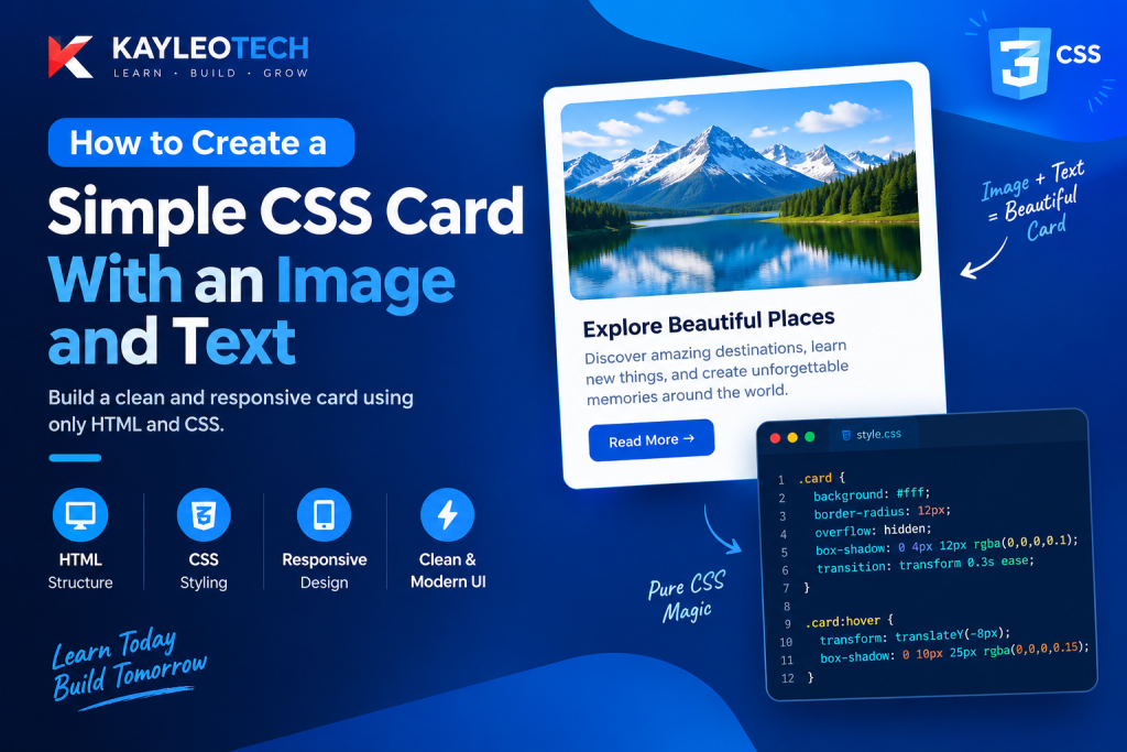
Creating a card with an image and text is one of the easiest ways to make a website look clean, organized, and professional. CSS cards are commonly used on blogs, business websites, portfolios, online stores, and landing pages to display information in a structured format.
If you have visited a website and seen a rectangular box containing an image, a heading, a short description, and a button, you have probably seen a CSS card.
The good thing is that you do not need advanced CSS knowledge to create one. With basic HTML and CSS, you can build a simple card that looks attractive and works on different screen sizes.
In this tutorial, you will learn how to create a simple CSS card with an image and text, starting with the HTML structure and then adding CSS styling. You will also learn how to control image sizes, add spacing, create rounded corners, apply shadows, and make your card responsive.
By the end of this guide, you will have a working CSS card that you can use in your own website projects.
What Is a CSS Card?
A CSS card is a rectangular section of a webpage that groups related information together. It usually contains an image, a heading, some descriptive text, and sometimes a button or link.
Cards help website visitors understand information quickly because related content is placed inside one organized section.
For example, a technology website can use cards to display different articles. Each card can contain a featured image, the article title, a short description, and a Read More link.
Other common uses include:
- Blog article previews.
- Product displays in online stores.
- Team member profiles.
- Portfolio projects.
- Service descriptions.
- Course and tutorial listings.
- News and technology updates.
A CSS card does not require a special HTML tag. You can create one using ordinary HTML elements such as <div>, <img>, <h2>, <p>, and <a>, then use CSS to control its appearance.
What You Need Before Creating a CSS Card
Before starting, you only need a few basic things:
- HTML: Used to create the structure of the card.
- CSS: Used to style the card, image, text, and other elements.
- An image: Used as the visual content of the card.
- A code editor: You can use Visual Studio Code or any other editor.
You do not need JavaScript or an external CSS framework for this tutorial.
We will use plain HTML and CSS to keep everything simple and easy to understand.
Step 1: Create the HTML Structure
The first thing you need to do is create the structure of your card using HTML.
HTML provides the elements that hold the image, heading, description, and link.
Create a file called index.html and add the following code:
<!DOCTYPE html>
<html lang="en">
<head>
    <meta charset="UTF-8">
    <meta name="viewport" content="width=device-width, initial-scale=1.0">
    <title>Simple CSS Card</title>
    <link rel="stylesheet" href="style.css">
</head>
<body>

    <div class="card">

        <img src="image.jpg" alt="A beautiful landscape">

        <div class="card-content">

            <h2>Explore the World</h2>

            <p>
                Discover beautiful places, learn new things,
                and explore amazing destinations around the world.
            </p>

            <a href="#">Read More</a>

        </div>

    </div>

</body>
</html>
Understanding the HTML Code
Let’s understand what each element does.
1. The <div> element
<div class="card">The <div> element creates the main container for the card.
Everything placed inside this element belongs to the card, including the image and text.
We also added a class called card. This class will help us select and style the container using CSS.
2. The <img> element
<img src="image.jpg" alt="A beautiful landscape">The <img> element displays an image inside the card.
The src attribute specifies the image location, while the alt attribute provides alternative text that describes the image.
For this example, replace image.jpg with the actual filename or image URL you want to use.
3. The .card-content container
<div class="card-content">This container holds the text content of the card.
It makes it easier to apply spacing and styling to the heading, paragraph, and link without affecting the image.
4. The <h2> element
<h2>Explore the World</h2>This displays the card heading.
You can change the heading to anything you want, depending on the purpose of your card.
5. The <p> element
<p>Discover beautiful places...</p>The paragraph provides a short explanation of the content.
6. The <a> element
<a href="#">Read More</a>This creates a clickable link that visitors can use to access another page or read more information.
The # is only a placeholder. Replace it with the actual destination URL when using the card on a real website.
Step 2: Add CSS to Style the Card
Now that the HTML structure is ready, the next step is to make the card look attractive using CSS.
Create another file called style.css and add the following code:
* {
    margin: 0;
    padding: 0;
    box-sizing: border-box;
}

body {
    font-family: Arial, sans-serif;
    background-color: #f4f4f4;
    display: flex;
    justify-content: center;
    align-items: center;
    min-height: 100vh;
}

.card {
    width: 300px;
    background-color: white;
    border-radius: 12px;
    overflow: hidden;
    box-shadow: 0 4px 12px rgba(0, 0, 0, 0.1);
}

.card img {
    width: 100%;
    height: 200px;
    object-fit: cover;
}

.card-content {
    padding: 20px;
}

.card-content h2 {
    font-size: 22px;
    margin-bottom: 10px;
    color: #222;
}

.card-content p {
    font-size: 15px;
    line-height: 1.6;
    color: #555;
    margin-bottom: 15px;
}

.card-content a {
    display: inline-block;
    text-decoration: none;
    background-color: #e63946;
    color: white;
    padding: 10px 18px;
    border-radius: 6px;
}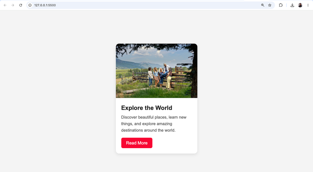
Suggested screenshot: Display the finished card with its image, heading, paragraph, and Read More button.
Step 3: Understand the CSS Properties
The CSS code above controls how the card looks and how its elements are arranged.
Let’s break down some important properties.
1. width
.card {
    width: 300px;
}
The width property controls the width of the card.
In this example, the card is 300 pixels wide.
You can increase or decrease this value depending on your design.
2. background-color
background-color: white;This gives the card a white background.
Without a background color, the card may blend into the webpage, especially if its surrounding area has a similar color.
3. border-radius
border-radius: 12px;The border-radius property creates rounded corners.
Instead of having sharp edges, the card gets a softer and more modern appearance.
You can use a smaller value for slightly rounded corners or a larger value for a more rounded design.
4. overflow: hidden
overflow: hidden;This property is important when creating cards with images.
It prevents the image or other content from extending outside the rounded corners of the card.
For example, without this property, the top corners of the image may extend beyond the card’s rounded edges.
5. box-shadow
box-shadow: 0 4px 12px rgba(0, 0, 0, 0.1);The box-shadow property adds a shadow around the card.
This makes the card appear slightly elevated above the background.
The values control the horizontal shadow, vertical shadow, blur, and color.
6. padding
.card-content {
    padding: 20px;
}
Padding creates space inside an element.
Here, it creates space between the card’s text content and the edges of its container.
Without padding, the heading and paragraph would appear too close to the edges.
Step 4: Make the Card Image Fit Properly
One common problem beginners experience when creating CSS cards is that images sometimes appear stretched, squeezed, or poorly positioned.
You can solve this problem using the CSS object-fit property.
Consider this example:
.card img {
    width: 100%;
    height: 200px;
    object-fit: cover;
}
Here is what each property does:
width: 100%makes the image fill the available width of the card.height: 200pxsets the image height.object-fit: covermakes the image fill its container without changing its original proportions.
The object-fit: cover property is particularly useful because it prevents images from looking stretched.
There are other values you can use:
| Value | Description |
|---|---|
cover | Fills the container while maintaining proportions, cropping when necessary. |
contain | Displays the entire image without cropping. |
fill | Stretches the image to fill the container. |
none | Displays the image at its original size. |
For most image cards, cover is a good choice because it creates a consistent image area.
Step 5: Add a Hover Effect to the CSS Card
You can make your card more interactive by adding a hover effect.
A hover effect changes an element’s appearance when a visitor moves their mouse over it.
For example, you can make the card move slightly upward and increase its shadow.
Add this CSS to your existing stylesheet:
.card {
    transition: transform 0.3s ease, box-shadow 0.3s ease;
}

.card:hover {
    transform: translateY(-8px);
    box-shadow: 0 10px 25px rgba(0, 0, 0, 0.15);
}
How Does This Work?
transition
This makes the change happen smoothly instead of instantly.
The 0.3s value means the transition takes approximately three-tenths of a second.
transform: translateY(-8px)
This moves the card upward by 8 pixels when someone hovers over it.
box-shadow
This increases the shadow, making the card appear slightly elevated.
These small effects can make a website feel more polished without requiring complicated animations.
Step 6: Make the CSS Card Responsive
A card that looks good on a desktop computer should also look good on smartphones and tablets.
Responsive design allows your card to adjust to different screen sizes.
For example, a fixed-width card may look fine on a large monitor but become too wide on a smaller mobile screen.
You can improve this by changing the card width to use a flexible maximum width.
Replace the existing .card width with:
.card {
    width: 100%;
    max-width: 350px;
    background-color: white;
    border-radius: 12px;
    overflow: hidden;
    box-shadow: 0 4px 12px rgba(0, 0, 0, 0.1);
}
This allows the card to occupy the available space while preventing it from becoming wider than 350 pixels.
You can also add a media query:
@media (max-width: 480px) {
    .card {
        max-width: 100%;
    }

    .card-content {
        padding: 15px;
    }
}
This reduces the content spacing on smaller screens.
For a single centered card, this may be enough. If you plan to display multiple cards in a row, you should also use CSS Grid or Flexbox to control how they rearrange on smaller devices.
Step 7: Complete HTML and CSS Card Example
Now let’s put everything together.
The following example combines the HTML structure and CSS styling into one file. You can copy it into your code editor, save it as index.html, and open it in your browser.
<!DOCTYPE html>
<html lang="en">
<head>
    <meta charset="UTF-8">
    <meta name="viewport" content="width=device-width, initial-scale=1.0">

    <title>CSS Image Card</title>

    <style>
        * {
            margin: 0;
            padding: 0;
            box-sizing: border-box;
        }

        body {
            font-family: Arial, sans-serif;
            background: #f4f4f4;
            min-height: 100vh;
            display: flex;
            justify-content: center;
            align-items: center;
            padding: 20px;
        }

        .card {
            width: 100%;
            max-width: 350px;
            background: white;
            border-radius: 12px;
            overflow: hidden;
            box-shadow: 0 4px 12px rgba(0,0,0,0.1);
            transition: 0.3s ease;
        }

        .card:hover {
            transform: translateY(-8px);
            box-shadow: 0 10px 25px rgba(0,0,0,0.15);
        }

        .card img {
            width: 100%;
            height: 210px;
            object-fit: cover;
        }

        .card-content {
            padding: 20px;
        }

        .card-content h2 {
            color: #222;
            margin-bottom: 10px;
        }

        .card-content p {
            color: #555;
            line-height: 1.6;
            margin-bottom: 18px;
        }

        .card-content a {
            display: inline-block;
            background: #e63946;
            color: white;
            padding: 10px 18px;
            border-radius: 6px;
            text-decoration: none;
        }

        .card-content a:hover {
            background: #c92532;
        }

        @media (max-width: 480px) {
            .card-content {
                padding: 15px;
            }
        }
    </style>
</head>

<body>

    <div class="card">

        <img
            src="https://images.unsplash.com/photo-1500530855697-b586d89ba3ee?w=700"
            alt="Beautiful natural landscape"
        >

        <div class="card-content">

            <h2>Explore the World</h2>

            <p>
                Discover beautiful places, learn new things,
                and explore amazing destinations around the world.
            </p>

            <a href="#">Read More</a>

        </div>

    </div>

</body>
</html>
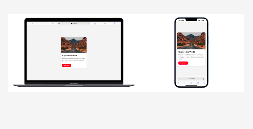
What should you expect when you run this code?
You should see a centered white card with a landscape image at the top, followed by a heading, a short description, and a red Read More button.
When you move your mouse over the card, it should move slightly upward and display a stronger shadow.
On smaller screens, the card should adjust to the available width.
Common Mistakes to Avoid When Creating CSS Cards
Although creating a CSS card is relatively simple, beginners sometimes make mistakes that affect the final design.
Here are some common problems and how to avoid them.
1. Forgetting overflow: hidden
If you use border-radius but forget overflow: hidden, the image may extend beyond the card’s rounded corners.
Solution: Add overflow: hidden to the main card container.
2. Using the Wrong Image Size
Images with different dimensions can make multiple cards look inconsistent.
Solution: Give the images a consistent height and use object-fit: cover.
3. Not Adding Padding
Without padding, the text may appear too close to the card’s edges.
Solution: Add sufficient padding to the .card-content container.
4. Forgetting Responsive Design
A card with a fixed width may overflow on smaller devices.
Solution: Use width: 100% and max-width to make it flexible.
5. Using Too Many Shadows and Effects
Adding too many visual effects can make your card look distracting.
Solution: Use subtle shadows, moderate rounded corners, and simple hover transitions.
6. Forgetting Image Alternative Text
An image without meaningful alternative text may be less accessible to visitors using screen readers.
Solution: Add a descriptive alt attribute to your image.
How to Create Multiple CSS Cards
Once you understand how to create one card, you can easily create multiple cards using the same HTML and CSS structure.
For example, if you want to display three blog posts, you can write:
<div class="cards">

    <div class="card">
        <img src="image1.jpg" alt="Laptop on a desk">
        <div class="card-content">
            <h2>Web Development</h2>
            <p>Learn the basics of building websites.</p>
            <a href="#">Read More</a>
        </div>
    </div>

    <div class="card">
        <img src="image2.jpg" alt="Mobile phone">
        <div class="card-content">
            <h2>Technology</h2>
            <p>Explore useful technology tips and guides.</p>
            <a href="#">Read More</a>
        </div>
    </div>

    <div class="card">
        <img src="image3.jpg" alt="Creative workspace">
        <div class="card-content">
            <h2>UI/UX Design</h2>
            <p>Discover the basics of user interface design.</p>
            <a href="#">Read More</a>
        </div>
    </div>

</div>
Add this CSS to arrange the cards:
.cards {
    display: grid;
    grid-template-columns: repeat(3, 1fr);
    gap: 20px;
}
You can also make the layout responsive:
@media (max-width: 768px) {
    .cards {
        grid-template-columns: repeat(2, 1fr);
    }
}

@media (max-width: 500px) {
    .cards {
        grid-template-columns: 1fr;
    }
}
Now, the cards will appear in three columns on larger screens, two columns on medium screens, and one column on smaller screens.
This approach is useful when building blog pages, product listings, and portfolio sections.
Best Practices for Creating CSS Cards
If you want your CSS cards to look professional and work properly, keep these points in mind:
- Use meaningful HTML elements to organize your content.
- Give images descriptive
alttext. - Use consistent image dimensions across multiple cards.
- Apply
object-fit: coverwhen you want images to fill a fixed area. - Use
border-radiusto create smooth corners. - Keep shadows subtle and avoid unnecessary visual effects.
- Use responsive widths instead of relying entirely on fixed dimensions.
- Maintain readable font sizes and sufficient color contrast.
- Make sure buttons and links have meaningful destinations.
- Use hover effects carefully and ensure important information is not available only on hover.
These practices help you build cards that are visually appealing, accessible, and easier to maintain.
Frequently Asked Questions (FAQs)
1. How do I create a simple card in CSS?
To create a simple CSS card, use an HTML <div> as the main container. Place an image, heading, paragraph, and link inside it. Then use CSS properties such as width, padding, background-color, border-radius, and box-shadow to style the card.
2. How do I add an image to a CSS card?
Use the HTML <img> element inside the card container. Set its width to 100% and use object-fit: cover to make the image fill the available space without stretching.
3. Which HTML tag is used to create a card?
There is no specific HTML tag for creating a card. Developers commonly use the <div> element, although semantic elements such as <article> and <section> can also be used depending on the content.
4. How do I make a CSS card responsive?
Use flexible widths such as width: 100% and max-width instead of relying only on fixed widths. You can also use CSS media queries to adjust the card layout for different screen sizes.
5. Can I create a CSS card without JavaScript?
Yes. You can create a fully styled CSS card using only HTML and CSS. JavaScript is not necessary for displaying an image, heading, description, or basic hover effect.
6. How do I add a hover effect to a CSS card?
Use the CSS :hover pseudo-class together with the transition and transform properties. For example, transform: translateY(-8px) moves the card slightly upward when a visitor hovers over it.
Creating a simple CSS card with an image and text is a useful skill for anyone learning web development. It helps you understand how HTML and CSS work together to organize and present information on a webpage.
In this tutorial, you learned how to create the HTML structure, add an image, style the card with CSS, control image dimensions, apply shadows, create hover effects, and make the design responsive.
You also learned how to display multiple cards using CSS Grid.
The most important thing is to understand the purpose of each CSS property instead of simply copying the code. Once you understand how the card is structured and styled, you can change its colors, dimensions, spacing, images, and layout to create your own designs.
Start with a simple card, experiment with different styles, and gradually build more advanced card layouts for your website projects.
Keep practising, because small projects like this are an important step toward becoming a better frontend developer.
Suggested SEO details for publishing
| SEO element | Recommendation |
|---|---|
| Focus keyword | How to Create a CSS Card |
| Secondary keyword | CSS card with image and text |
| Additional keyword | Simple CSS card design |
| Search intent | Informational / practical tutorial |
| SEO title | How to Create a Simple CSS Card With Image and Text |
| Suggested URL slug | create-simple-css-card-with-image-and-text |
| Suggested meta description | Learn how to create a simple CSS card with an image and text using HTML and CSS. Follow beginner-friendly examples to style, customize, and make responsive cards. |
Recommended internal links: Link this tutorial to your existing articles about CSS selectors, CSS box model, CSS Flexbox, CSS Grid, HTML <div> element, and CSS border-radius. These links will help readers continue learning related concepts on Kayleotech.
Try it yourself
Change the code, then run it to see the result.