When you start learning CSS or working on a website, one of the first confusing things you will meet is CSS units. You might see values like 16px, 1rem, 2rem, and wonder what they really mean. Two of the most common units you will use are px and rem.
At first, they may look similar because both control size. But they behave very differently, and choosing the right one can make your website easier to use, more flexible, and more accessible.
This article explains what px and rem are, how they work, their differences, when to use each one, and which is better for modern websites.
Understanding CSS Units in Simple Terms
CSS units tell the browser how big something should be. That something could be text, spacing, width, height, or margins.
There are two main types of CSS units:
- Absolute units
- Relative units
px is considered an absolute unit
rem is a relative unit
This difference is very important.
What Is px?
px stands for pixels.
A pixel is the smallest visible dot on a screen. When you use px in CSS, you are telling the browser to display something at an exact size.
Example:
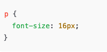
How px Works
Pixels are fixed.
If you set something to 100px, it will stay 100px.
This gives you:
- Predictable layout
- Precise control
- No surprises
But it also creates limitations.
Advantages of Using px
Using px has some benefits, especially for beginners.
1. Easy to Understand
px is straightforward.
If you say 20px, you know exactly how big it is.
2. Precise Control
Designers like px when they need exact spacing, borders, or small UI details.
3. Consistent Look
The size will not change based on parent elements or user settings.
Disadvantages of Using px
Despite being simple, px has serious downsides.
1. Poor Accessibility
If a user increases their browser font size, px-based text may not scale properly.
2. Not Responsive Friendly
px does not adapt well across devices with different screen sizes.
3. Hard to Scale
If you want to change your whole website’s font size, you must update many px values manually.
What Is rem?
rem stands for root em.
Unlike px, rem is relative.
It is based on the root font size of the document.
The root font size comes from the <html> element.
By default:
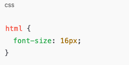
So:
1rem = 16px2rem = 32px0.5rem = 8px
How rem Works
When you use rem, the browser calculates the size based on the root font size.
Example:
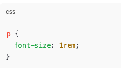
If the root font size changes, all rem values update automatically.
This makes rem very powerful.
Why rem Is Called “Root em”
There is another unit called em.em is relative to the parent element.
rem is relative to the root element.
This means rem is:
- More predictable
- Easier to manage
- More consistent across components
Advantages of Using rem
1. Better Accessibility
Users who increase text size in their browser will see your site scale correctly.
2. Easy Scaling
You can resize the entire website by changing one value.
Example:
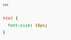
Every rem value adjusts automatically.
3. Cleaner Design System
rem makes it easier to build consistent spacing, typography, and layouts.
4. Responsive Friendly
rem adapts better to different screen sizes and user preferences.
Disadvantages of Using rem
1. Slight Learning Curve
Beginners may find rem confusing at first.
2. Requires Planning
You need to think in scale, not fixed numbers.
3. Depends on Root Size
If the root font size changes unexpectedly, it affects everything.
| Feature | px | rem |
|---|---|---|
| Type | Absolute | Relative |
| Scales with user settings | No | Yes |
| Accessibility | Poor | Better |
| Responsive design | Limited | Strong |
| Easy for beginners | Yes | Moderate |
| Best for text | Not ideal | Ideal |
| Best for layout control | Yes | Yes |
Which One Is Better?
The answer depends on what you are building.
But for modern websites:
👉 rem is generally better than px, especially for text and spacing.
px is still useful in some cases, but rem is the preferred choice for:
- Font sizes
- Margins and padding
- Layout spacing
- Scalable design systems
When Should You Use px?
Use px when:
- You need exact sizes
- You are styling borders
- You are working on icons
- You are controlling thin lines or shadows
Example:

px works best for small fixed details.
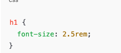
When Should You Use rem?
Use rem when:
- Styling text
- Creating consistent spacing
- Building responsive layouts
- Improving accessibility
- Designing scalable interfaces
Example:
How rem Improves Accessibility
Accessibility means everyone can use your site, including users with vision problems.
If a user increases browser font size:
- px-based text may stay small
- rem-based text grows naturally
This makes rem more user-friendly and inclusive.
How rem Helps Responsive Design
Different devices have different screen sizes.
With rem:
- Text scales better
- Layout feels balanced
- Design adapts naturally
Many modern frameworks use rem for this reason.
Common Beginner Mistake
A common mistake is mixing px and rem randomly.
This causes:
- Inconsistent design
- Unexpected sizing issues
- Hard-to-maintain code
A better approach:
- Use rem for text and spacing
- Use px for borders and fine details
Simple Example Without Code Confusion
Think of px like:
Measuring with a ruler that never changes.
Think of rem like:
Measuring based on a base size that can grow or shrink.
If the base grows, everything grows together.
Why Modern CSS Prefers rem
Modern web design focuses on:
- Accessibility
- Scalability
- Maintainability
- User experience
rem supports all of these better than px.
That’s why many developers today prefer rem.
Should You Stop Using px Completely?
No.
px still has a place.
But you should avoid using px for:
- Font sizes
- Major layout spacing
Use px wisely, not everywhere.
Best Practice Recommendation
A good modern approach is:
- Set a base font size on
html - Use rem for most sizes
- Use px only when needed
This keeps your design flexible and clean.
Understanding rem vs px is a big step in becoming better at CSS.
px is simple and precise, but rigid.
rem is flexible, scalable, and user-friendly.
If you care about:
- Accessibility
- Responsive design
- Clean CSS
- Future-proof layouts
Then rem is the better choice.
px still has value, but rem helps you build websites that grow, adapt, and feel modern.